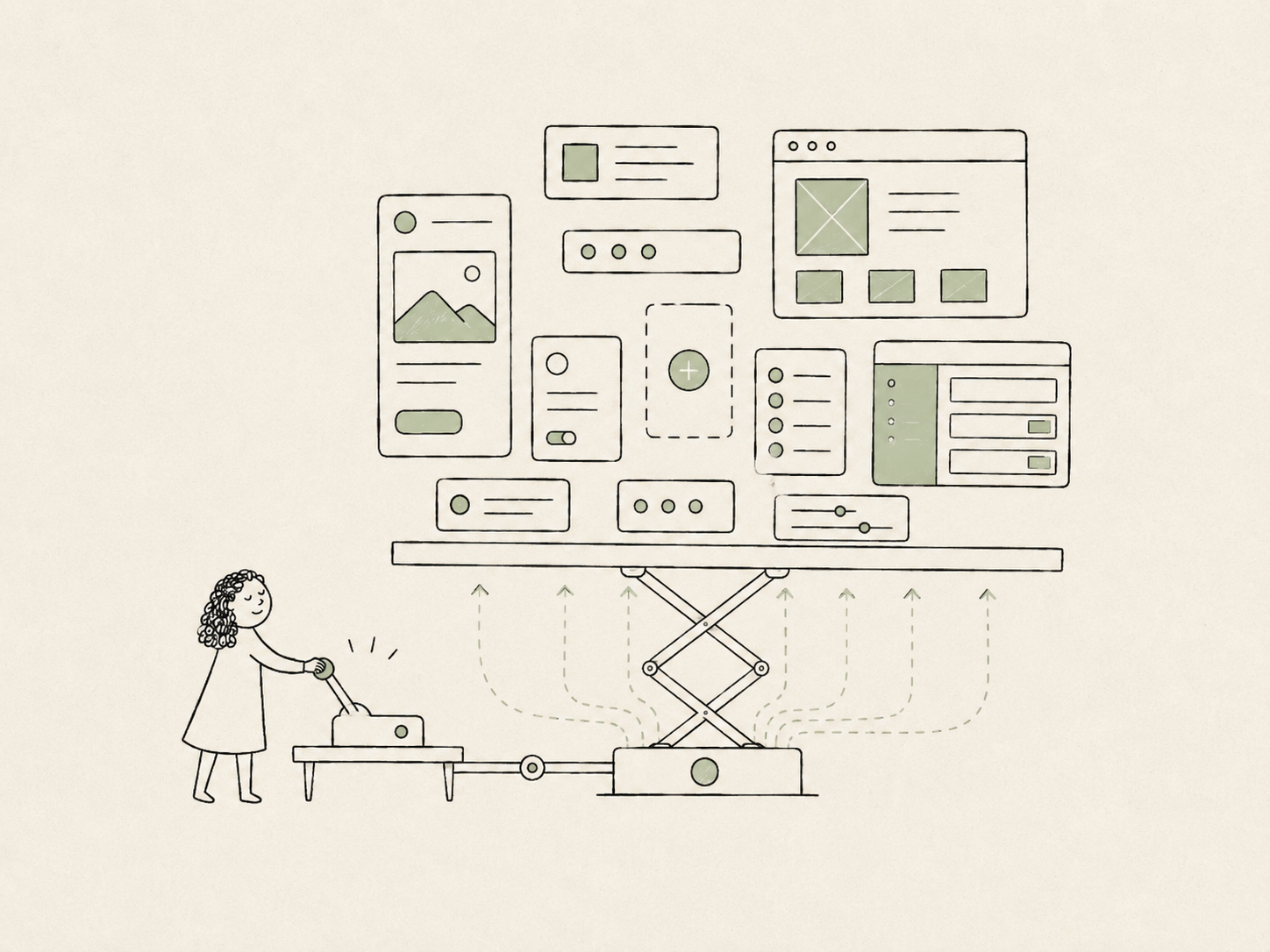
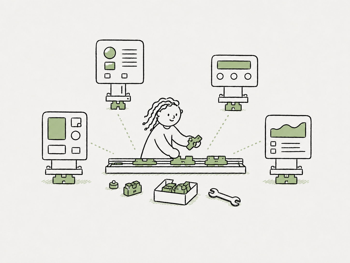
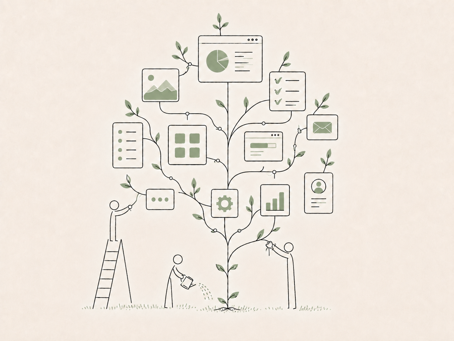
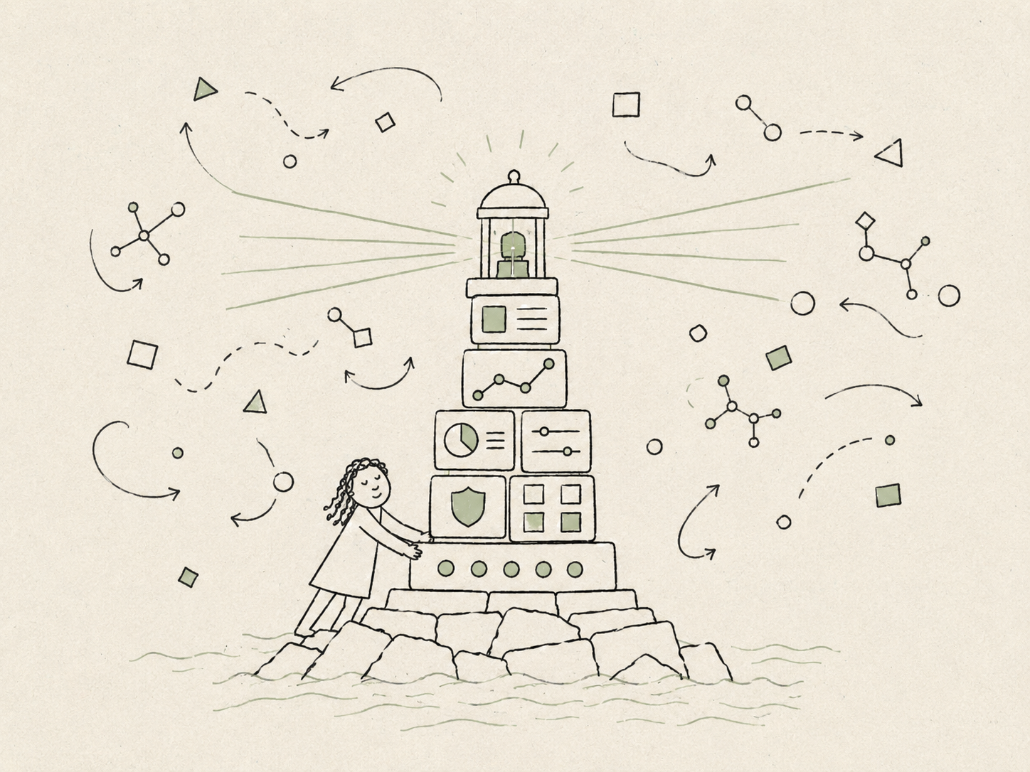
Across our VP's org, a small design team was supporting more products than we could realistically cover directly: ten or more existing cloud products, plus roughly three new 0→1 products each year. The design system started as a way to close that gap.
Founding design system designer · Jan 2023 – Present
Team. I partnered with my design manager, who brought deep design-engineering and systems expertise. We formed the two-person core team, with support from a small group of front-end engineers.
My role. I led the design-system strategy and owned the Figma architecture, including the token model, theme switching, and the full UI kit. I also defined the component properties, handoff specifications, and API decisions connecting the Figma and React libraries, and created the product patterns, usage guidance, and system documentation. My manager led the technical architecture, release infrastructure, CLI tooling, and core React implementation, while contributing engineers extended the library with additional components.
100%adoption across the VP's org, year one
~40%faster front-end implementation
80+Figma & React components
10+products building on it
01A system is leverage, not consistency
At first, the problem looked like consistency. Each product had grown around whichever third-party UI library its team had chosen, so products across the same company ended up with different visual languages, interaction patterns, motion, and levels of accessibility.
But those differences were only the visible symptom. Each team was also rebuilding its own foundation and making the same baseline product decisions separately. For a small design team supporting this many products, too much of our time was going back into work that had already been solved somewhere else.
That changed how I thought about consistency. It mattered, but mainly because it created leverage. If the system could take on the repeatable decisions—visual language, interaction patterns, motion, and accessibility—the team could spend more time on the work that actually shaped each product: the problem it solved and how the workflow should behave.
We had no dedicated design-system team, and products were spread across separate repos and component stacks. The system could not depend on us reviewing every screen or asking teams to rebuild around a single new foundation. It had to fit into how products were already being built and help teams make sound routine decisions even when a designer was not in the room.
02Fewer decisions, not more components
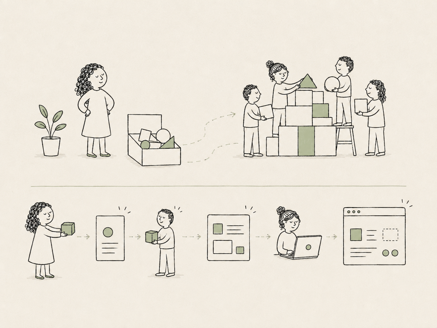
The obvious place to start was the component layer. I audited the existing products, cleared out legacy inconsistencies, and built a core set of reusable components: buttons, inputs, tables, modals, navigation, and the other foundations teams kept rebuilding.
But as I worked more closely with engineers, I realized the component itself was rarely what slowed them down. The harder questions sat around it: how to structure a form, how to lay out a settings page, what belonged in a wizard rather than a table, and where actions should live. Those decisions were being made repeatedly by people who did not really want to be designing.
So I began shifting the system from reusable parts to reusable decisions. Common page structures, flows, and recurring B2B patterns became starting points that teams could adapt, rather than problems they had to solve again from a blank page.
I knew the shift was working when engineers began using the system to answer their own questions. Someone building an onboarding stepper, unsure where Cancel, Back, and Next should go, could find the pattern and move forward instead of guessing or waiting for me.
03A system should outgrow its creators
As the library grew, the challenge shifted from building the system to making sure it could keep working without its original creators at the center.
Brand decisions at the system level. Product UI had evolved separately from Fortinet's marketing brand, leaving each team to interpret branding for itself. I defined a three-level token architecture and worked with our design engineer to carry it into React. When Fortinet went through a company-wide brand renewal, we could make those decisions once in the system and apply them across four product themes, plus light and dark mode, instead of redesigning each product surface by hand.
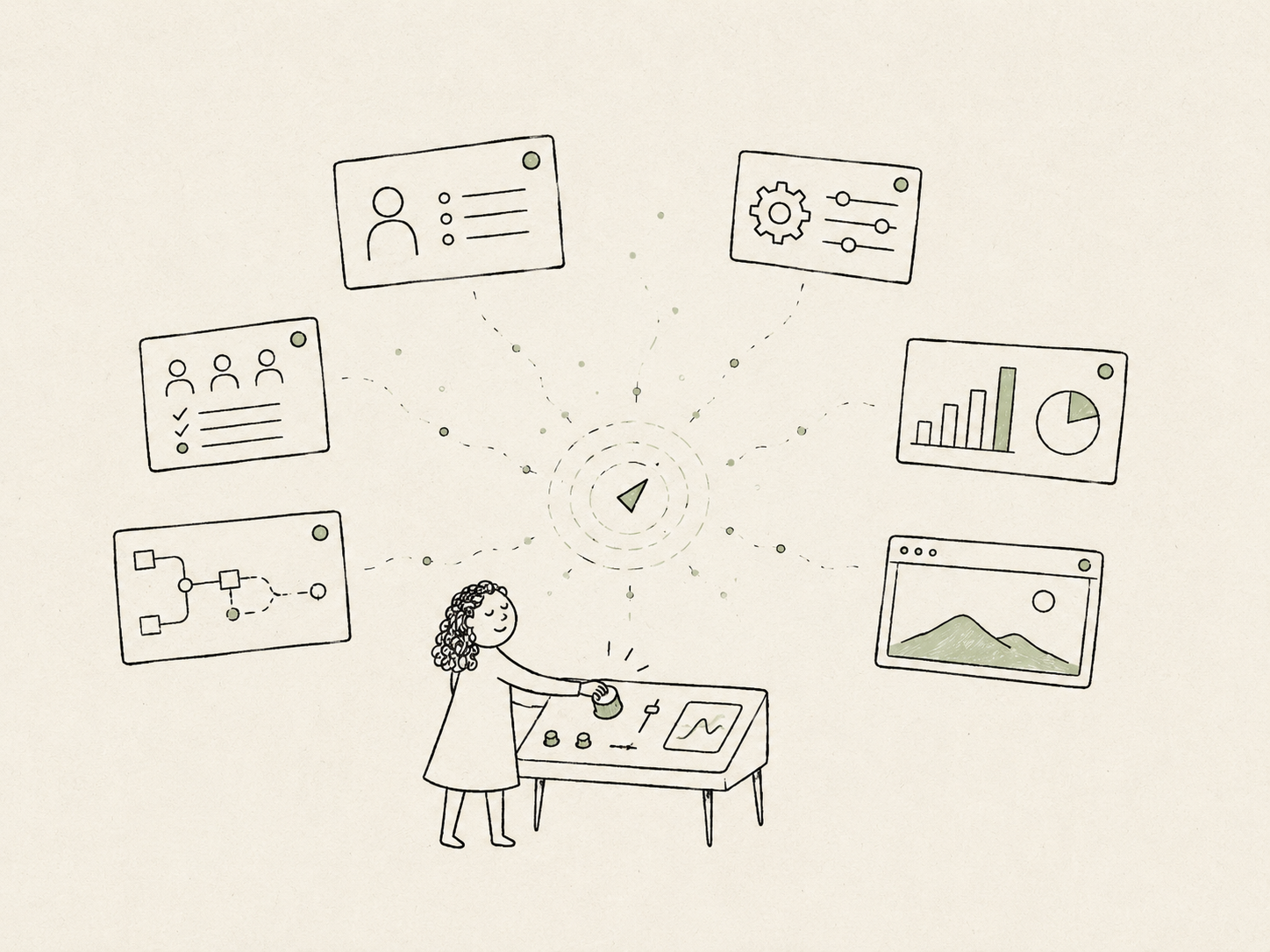
Design and code in one place. Security restrictions meant we could not use external tools such as Storybook or ZeroHeight, so we built our own internal playground. It brought the Figma and React libraries, patterns, boilerplates, specifications, release history, and live theme switching into one shared space. Designers and engineers could work from the same source of truth, and new teams had a clear place to begin.
Maintenance that did not live in my head. I wrote AI agent skills to handle repetitive checks behind component work—from token naming and API overlap to changesets and Figma sync. I also built accessibility guardrails into the contribution skill, prompting the agent to run axe and Playwright checks for keyboard behavior, focus management, and semantics whenever a new component was proposed. Public API changes still came back to the design team, but contributors could catch common issues before review instead of relying on someone to remember every rule.
By then, the system had grown to more than 80 aligned Figma and React components and was reducing front-end implementation time by roughly 40%. More importantly, it could keep growing without every decision passing through the two-person core team.
04Every abstraction has a price
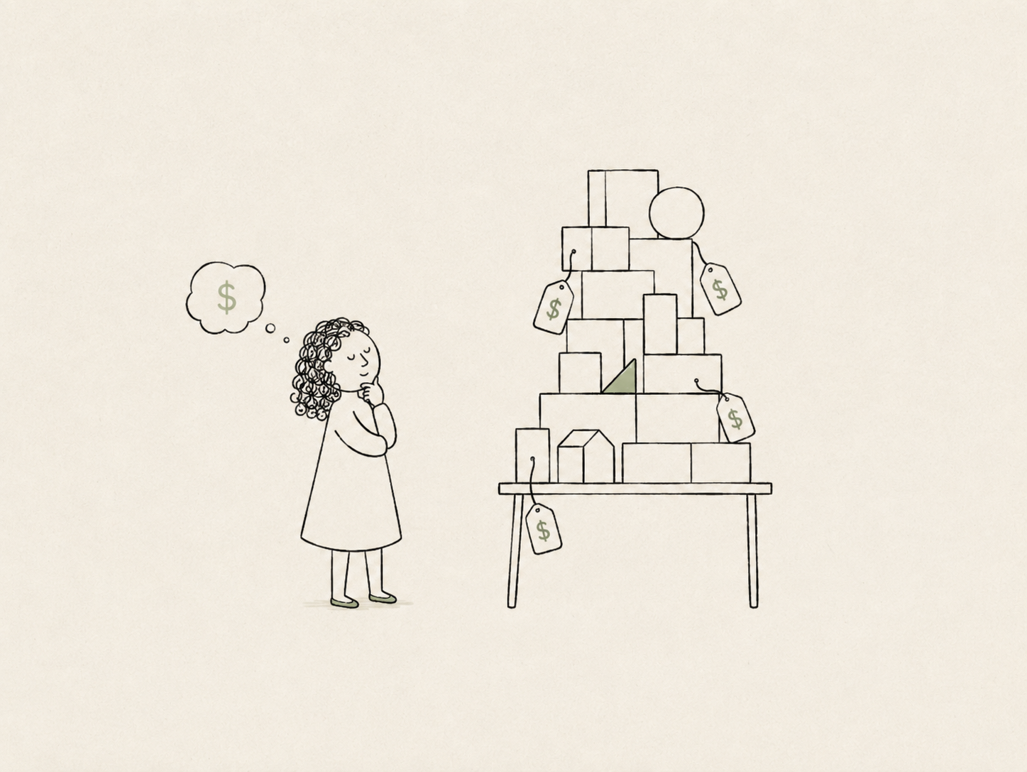
I did not get the scope right at first. My instinct was to make every design decision configurable, assuming that more flexibility would make the system safer against future change.
That turned out to be the wrong kind of flexibility. At one point, the system had grown to almost 20,000 tokens across more than 80 components. The naming model became difficult to reason through, and even linting or automation could not reliably predict which token someone meant to use. Instead of making the system easier to maintain, the extra abstraction made it heavier, harder to search, and harder to trust.
I led several rounds of cleanup to simplify the architecture and remove abstractions that were not protecting against a real kind of change. The experience changed how I think about systems: I stopped asking whether something could be abstracted and started asking what change the abstraction was actually preparing us for.
05Fit the company, not the ideal
Not every designer gets to work in a culture where design is already deeply valued or where the tooling already meets industry standards. This work was never about building the ideal design system I had in my head. It was about building one that fit the company I was actually in: its constraints, its habits, and the way people already made decisions.
You cannot change that overnight. Part of the craft was knowing when to push and when to make the better path easier to follow. Instead of introducing a heavy contribution process, I kept the system open. If someone ran into a token that fell short or a pattern that was missing, they could propose a change. The standards stayed clear, but the gate stayed light.
Without a dedicated team to maintain it, the system could only keep growing if other people felt a sense of ownership. My job was not to control every answer. It was to keep the direction clear enough that other teams could contribute well without asking for permission every time.
Case study · FortiAIGate
Designing for a moving target
FortiAIGate is Fortinet's most valued product for monitoring and governing enterprise AI traffic, built in partnership with NVIDIA. It helps companies understand which models, tools, and agents are being used, what they cost, what they are being used for, and where guardrails need to step in.
I started with the product still looking for its shape. Different teams needed different views of AI usage, and no single dashboard or metric could tell the full story. The challenge was deciding what mattered, who needed to see it, and what decisions the product should support—all from scratch.
Sole product designer · 2025 – Present
My role. As the sole product designer, I owned the end-to-end product experience—from early research and product hypotheses to the setup model, role-based views, interaction design, prototyping, and handoff. I helped take the product from early concept to beta and continue to shape it toward GA with early enterprise customers.
01Designing meant finding the first signals
With no external customers to study yet, I needed a practical starting point. I treated Fortinet as the first customer and spoke with the people closest to the problem: leadership, IT, finance, managers, and the engineers setting up models and API access.
I also looked outside the company so I would not overfit the product to our own assumptions. I studied open-source tools in the same space and worked backward from their interfaces: which use cases they prioritized, which users they seemed to design for, and which signals they treated as important.
Together, those inputs gave me an initial set of hypotheses about the users, the questions they needed answered, and the level of detail each role required—without pretending any of them were final.
02What the first version taught me
Those early hypotheses gave me enough to shape a first version. The setup followed what felt like a reasonable sequence at the time: configure the keys, choose the models, set budgets, add guardrails, and move on. It was a useful working model—something concrete enough for the team to design against, begin building, and learn from.
But as we moved closer to launch, the assumptions behind that model began to shift. Tool calling, MCP, agents, skills, and new cybersecurity models all changed what the product needed to observe and govern, as well as how those resources related to one another. A guardrail might apply to a model, a tool, an MCP server, an agent, or a combination of them.
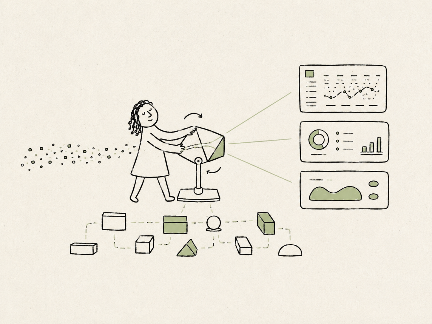
The original flow was still usable, but the structure underneath it was too closely tied to one version of how enterprise AI governance worked. So I stopped treating setup as a fixed sequence and began breaking it into parts the product could recombine. Users could still begin with a guided path, but the underlying structure no longer depended on that path—or the current technology model—remaining permanent.
03The same data meant different things
The same problem appeared in the dashboard. My first instinct was to give everyone one shared view with filters. It seemed simpler, but it assumed every user was starting from the same question. They were not.
Leadership wanted to understand overall adoption and risk. Finance needed to see where spend was going. Managers wanted to know how their teams were using AI and whether the cost was justified. Operators needed the raw traffic, guardrail events, tool calls, and traces behind those summaries.
That led me to design role-specific views across two levels of detail. Operators could stay close to the underlying traffic and investigate what happened, while leadership, finance, and managers could begin with an interpretation shaped around the decisions they needed to make.
Metrics made the difference especially clear. Token volume looked useful at first, but it could be misleading on its own. A team using a stronger model might solve a task in a few direct calls, while another using a cheaper model might generate far more tokens through repeated retries. Ranked only by volume, the second team would appear more active even if the first was producing better outcomes with less effort.
Ranked by raw tokens, Team B looks the most active. Weight the same traffic by cost and context, and Team A — fewer tokens, better outcomes — is the one creating value. Each ring maps to the view built for that role.
The point was not to create one universal measure of value. It was to recognize that the same traffic needed different context: raw evidence for operators, cost context for finance, and a clearer view of adoption, risk, and outcomes for leadership and managers.
I began treating the dashboard less like one report with different filters and more like a set of views that translated the same underlying activity into the right level of evidence for each role.
04The process had to move faster too
As the product model kept evolving, it became clear that our design process needed to move faster with it. By the time we had designed, reviewed, and begun building one direction, changes in the AI landscape could already weaken some of the assumptions behind it.
I did not want design or front-end iteration to become the bottleneck while the product was still finding its shape. We needed a faster way to try flows, test behavior, and decide which directions were worth carrying forward.
I began pushing for that workflow within the team. I helped secure access with my manager and VP to bring Claude to the team, at a time when access to these tools was still limited across the company, which encouraged other teams to start adopting this new way of building.
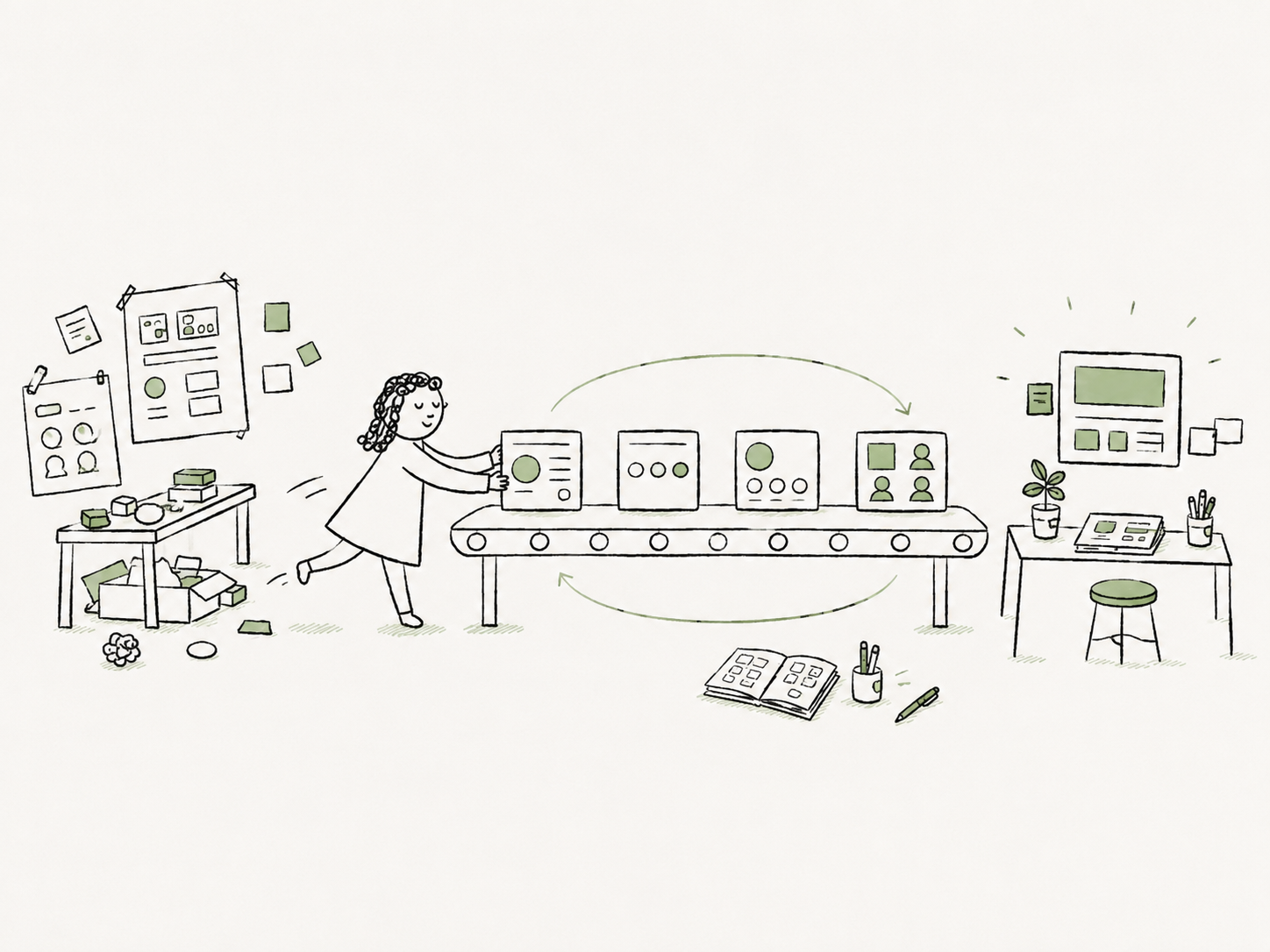
With effective tools in place, I started building small working prototypes in code—not as production code, but as a way to test interaction earlier. They helped me evaluate the parts that were difficult to judge in static screens alone: setup sequences, changing and empty states, role-based views, and whether a flow still held together when the underlying objects changed.
This gave us a shorter learning loop: test the uncertain parts first, then invest in polish once the direction had proved itself.
05Build on what holds still
Moving faster helped us respond to change, but the product still needed something more stable to build around.
I did not design for whichever AI pattern wins this year. I designed for what stays true underneath it: companies still need to see what their systems are doing, control what those systems can touch, and give different people different levels of detail.
The people using the product also do not want to relearn a new set of concepts and settings every few weeks. The shifting landscape is already noise; the interface should not add to it.
Its job is not to track every trend. It is to absorb the instability those trends create and quietly help people understand, configure, and manage what their AI is doing—giving them a clear decision instead of one more thing to keep up with.